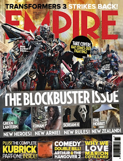
Here are some examples of Empire magazine covers that we studied. Our aim was to take the main elements that were iconic to the Empire front cover and then incorporate them within our own design while still reflecting our chosen theme of Horror. Here are a list of features:
-The bold red empire title is placed in the centre at the top
-barcode remains in the bottom right
-One prominant image is used to attract the readers attention
-The text is often in vivid colours such as white and yellow whcih is then placed against a dark background to make it stand out
-tag lines and stories are advertised relating to th main topic
We decided to make an intial design so we could experiment and get an idea of what our front cover will look like when it's completed. This also allowed us to become more familiar with the software, Photoshop, and develop our skills. Firstly we took an image of an Empire magazine and opened it onto Photoshop. Then using the wand tool we carefully selected around the title and deleted the background.
We came to the conclusion that the main image on the front cover should be of Kira, who plays the part of Ruth the spirit because our trailer is based around this character and the close up of her facial expression will capture the readers attention. For our rough copy we took this image of a young girl from the tv advert phones 4 u. For our final piece we plan to take a close-up of Kira in her red dress against a black canvas so that it will be easier to edit. Her red dress also relates back to our trailer and suggest the idea of horror and blood.
Our production name Running Inc. had the animation of running ink at the beginning of our trailer. We incorporated this element within our poster and the ink can be seen dripping from the eye. We thought that we could use this again on our magazine cover.
From looking at previous Empire magazines we noticed that the backgrounds appear to be quite blurred and don't have too much detail because the attention doesn't want to be distracted from the main image.
Here is our mock up. As you can see the quality will be improved but this was just a chance to see what works and what needs to be improved on our final piece! :)


No comments:
Post a Comment