
Thursday 15 December 2011
Tuesday 13 December 2011
Problem Encountered!
After just finishing our photoshoot for our magazine cover we went to save our images onto our memory stick however, after using the school camera and memory card we found our photos had been deleted from the camera as the memory card was swiped after an previous student has used it. We now realised we should've immediately put the images onto our card thus to over come this we decided to use the last still at the end of our trailer for our magazine cover due to limited time; upcoming deadline.
Monday 12 December 2011
Magazine Cover Photoshoot
From looking at previous magazine covers for inspiration we concluded that we wanted to use a strong image to get the readers attention. We used our lesson time on Friday 9th December to take the photo in the design and technology block against the black screen, which is reguarly used for photography. We thought that this would be an appropriate location because it will make Kira's (who plays Ruth) face stand out and create a strong contrasting affect. We set up the lighting and altered the height of the equipment so that when they were turned on, they shon upwards underneath kiras face, creating an eerie shadow. We took various closeups of Kiras face with a scary expression, by making sure her head was slightly tilted forwards and her hair was sweeping accross her face to achieve the creepy look.
For the costume, we stuck to the red dress that she wore in the trailer because it is a significant colour that viewers will be able to relate back to. We kept the make-up quite basic and just applyed face powder so that she appeared a bit paler and thus more ghost like. Overall it was as successful photoshoot and we look forward to editing and making the magazine poster!
For the costume, we stuck to the red dress that she wore in the trailer because it is a significant colour that viewers will be able to relate back to. We kept the make-up quite basic and just applyed face powder so that she appeared a bit paler and thus more ghost like. Overall it was as successful photoshoot and we look forward to editing and making the magazine poster!
Thursday 8 December 2011
Magazine Inital Idea
Here are some examples of Empire magazine covers that we studied. Our aim was to take the main elements that were iconic to the Empire front cover and then incorporate them within our own design while still reflecting our chosen theme of Horror. Here are a list of features:
-The bold red empire title is placed in the centre at the top
-barcode remains in the bottom right
-One prominant image is used to attract the readers attention
-The text is often in vivid colours such as white and yellow whcih is then placed against a dark background to make it stand out
-tag lines and stories are advertised relating to th main topic


We decided to make an intial design so we could experiment and get an idea of what our front cover will look like when it's completed. This also allowed us to become more familiar with the software, Photoshop, and develop our skills. Firstly we took an image of an Empire magazine and opened it onto Photoshop. Then using the wand tool we carefully selected around the title and deleted the background.

We came to the conclusion that the main image on the front cover should be of Kira, who plays the part of Ruth the spirit because our trailer is based around this character and the close up of her facial expression will capture the readers attention. For our rough copy we took this image of a young girl from the tv advert phones 4 u. For our final piece we plan to take a close-up of Kira in her red dress against a black canvas so that it will be easier to edit. Her red dress also relates back to our trailer and suggest the idea of horror and blood.


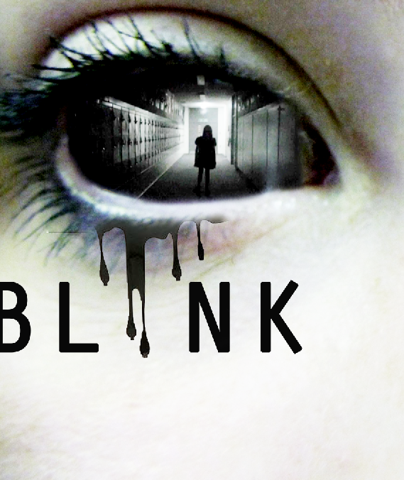
Our production name Running Inc. had the animation of running ink at the beginning of our trailer. We incorporated this element within our poster and the ink can be seen dripping from the eye. We thought that we could use this again on our magazine cover.

From looking at previous Empire magazines we noticed that the backgrounds appear to be quite blurred and don't have too much detail because the attention doesn't want to be distracted from the main image.

Here is our mock up. As you can see the quality will be improved but this was just a chance to see what works and what needs to be improved on our final piece! :)
Magazine Cover!
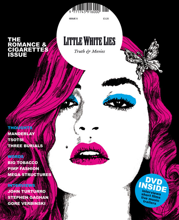
Today we were told we needed to do a magazine cover! :) So we decided to look into different magazines in which we believe our film would be featured in, these were:
- Little White Lies
Little White Lies is an independent film magazine produced by The Church of London.
 The design of each issue of Little White Lies is inspired by its feature film, represented on the cover by an illustration of its lead actor. The cover film also influences interior aspects, such as editorial icons, chapter headings and custom typefaces. However, the overall template of the magazine remains the same.
- Studio
 The Studio Magazine was an illustrated fine arts and decorative arts magazine, founded in Britain in 1893.Copies of the magazine survive either as individual copies in their rather flimsy card covers, or as hardback bound volumes, usually containing four monthly issues.
- Sight and Sound
Sight & Sound is a British monthly film magazine published by the British Film Institute (BFI).
 We are not sure about the appearance of Sight and Sound magazine , as we believe it looks slightly simplistic and less commercial which is not what we wish for as we believe Blink would be a more dependent and larger movie; associated with Warner Bros. We were looking for something in which we could express the darker side of the movie to the audience with an interesting magazine layout.

 Empire is a British film magazine published monthly by Bauer Consumer Media and is the biggest biritsh film magazine.
We particularly like Empire magazine as could be well used for our specific genre and can experiment with different layouts and be inventive. We also can imagine our film being promoted using this magazine and have already thought of appropiate ideas!
- Little White Lies
Little White Lies is an independent film magazine produced by The Church of London.
 The design of each issue of Little White Lies is inspired by its feature film, represented on the cover by an illustration of its lead actor. The cover film also influences interior aspects, such as editorial icons, chapter headings and custom typefaces. However, the overall template of the magazine remains the same.
We are not sure that Little White Lie's magazine is appropiate for our film Blink as the layout is always quite Pop Art and artisitc which wouldnt relate too well with our production.
 The Studio Magazine was an illustrated fine arts and decorative arts magazine, founded in Britain in 1893.Copies of the magazine survive either as individual copies in their rather flimsy card covers, or as hardback bound volumes, usually containing four monthly issues.
We thought this was slightly more modern with the look yet believe the films advertise are not as well known. However, we do like the layout of this magazine.
- Sight and Sound
Sight & Sound is a British monthly film magazine published by the British Film Institute (BFI).
 We are not sure about the appearance of Sight and Sound magazine , as we believe it looks slightly simplistic and less commercial which is not what we wish for as we believe Blink would be a more dependent and larger movie; associated with Warner Bros. We were looking for something in which we could express the darker side of the movie to the audience with an interesting magazine layout.
 - Total Film

Total Film is a British film magazine published 13 times a year (every four weeks) by Future Publishing. We really like this layout as we beloieve we could be quite inventive with ideas and bring accross the horror genre. The only downside is the text is quite modern in which wouldnt work too well however we were sure to overcome this.
- Empire

We particularly like Empire magazine as could be well used for our specific genre and can experiment with different layouts and be inventive. We also can imagine our film being promoted using this magazine and have already thought of appropiate ideas!
Friday 2 December 2011
OUR FINAL POSTER!
This is our final poster! We incorprated with our inital ideas with the screen shot in the eye and the ink out of its eye!


Here are print screens from our own trailer production company logo. As you can see the quality of the ink isn't very good and it appears to be pixilated. However, we decided to use some of these print screens and using the software Photoshop we managed to adjust them to our satisfaction.


These are a selection of images we chose to influence our final design. They are all from Google and from this we were able to draw our own ink drop outlines. Steph drew the outlines onto a4 paper and scanned them in . On photoshop we removed the white background and then using the fill tool we made them a black colour.
Teaser Poster!
After researching more posters and looking at our poster and trailer, we thought it would be more appropiate to make a teaser poster instead of an actual advertisement type of synergy of the film. Our trailer says 'Coming Soon' with the website so we thought as a group it would make sense including this on our poster instead of credits and logos.
Such posters we looked at as influences;


 All involving the title of the film or logo and the date for when it is screened. We found these posters more eyecatching focusing on the main image which we thought is more eyecatching looking at only the image. Because of our favourite poster idea is the close up of the eye we thought along with our miminal details on our trailer we thought a teaser poster would work better and be more successful to an audience; eyecatching.
Such posters we looked at as influences;


Thursday 1 December 2011
Tagline Ideas!
As a group we thought of different tag lines in which we could include on our poster! These are the ones we came up with:
1)'What can happen in a blink of an eye?'
2)'Shut Away Fear'
3)'Beware of the Blink'
4)'The diary unleashed'
5)'Run from prying eyes'
Looking back over these 5 potential tag lines we came to the conclusion that we didn't want to include the name of our film in the actual tag line itself. Therefore it was between 'Shut Away Fear' and 'Run from prying eyes'. We couldn't decide on which one would be more affective, so we got feedback from the rest of our media class and they voted for the tag line Run From Prying Eyes. As a group we thought this would work well with our storyline and the idea of the chase from the evil character Ruth.
Tuesday 29 November 2011
Development of our ideas!
Here are a few shots of which we developed our poster ideas just for inspiration to help us understand what works and what may not...
Ideaaaa (1)


Ideaaa (2)


Other ideas:

Wednesday 23 November 2011
Initial Poster Idea..
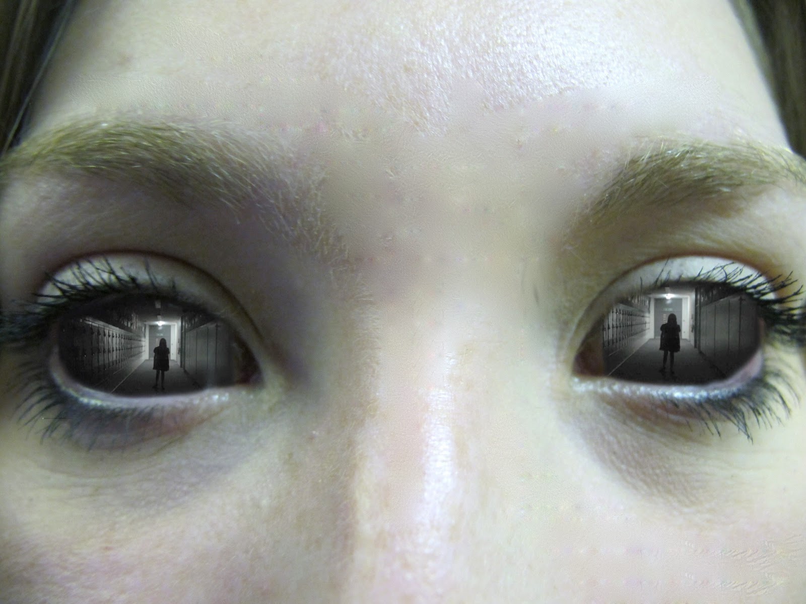
This is our inital poster idea! From our location shots where we had tested with practise shots before making our trailer we tested our idea with this image of Steph's eyes to see if our idea would be successful or not.

We did this via AS Photoshop C5 by opening both images in Photoshops and clicking; Command A which selects the whole image so we could copy and paste it onto the eyes photo (Command and V). We then had to transform this image; Command and T and dragging the corner arrows inwards in hope to smallen the photo. We found it easier to zoom into the photo by this point for us to gain a better understanding whether it would work for our project and would fit in the eyes. Because we copied and paste this it is an seperate layer so we could rub out the access of the photo in which would appear around the eyes using the rubber tool on the side bar. We found this quite difficult at first as we werent completely sure where the eyes finished however after chaning the opacity (above the layers) and pulling the bar down, we could clearly see where the photo ended.
We are happy with this design as it looks slightly eerie and creepy showing the genre quite clearly. The only issue we think is what else we would include on the poster deciding on whether we'll have it landscape or portrait.
Tuesday 22 November 2011
Our poster ideas :)
This is a mindmap with ideas we want to include within our poster. Firstly we mentioned that we wanted to incorporate our production title (Running Inc. production) by using an image of dripping ink. From looking at other influential posters we decided we wanted to use a bold, strong image of an eye because it links in with the title of our film 'Blink'.

Here are 4 poster sketches we made in class using our brainstorm as an influence to create an potential poster. We wanted to use the diary, Ruth's eyes and ink to represent our production company in our poster so these show the different ways we could present these in a poster.


Monday 21 November 2011
Influences for Poster..
A presentation (by Cindy) of posters which as a group we collected in class, with added descriptive evidence as to why we liked them and how they can influence our poster.
Sunday 20 November 2011
OUR TEASER TRAILER!
Our final teaser trailer! We're happy with our final outcome and look forward to hearing others feedback once we have our screening session.
Saturday 19 November 2011
Our trailer so far..
Development: What we wish to change:
- The opening clip with the puddle we decided to make longer to help introduce a build up in the trailer
- We wish to cut the effect of the library scene as it was too fast and to create a contrast between the scary 'darker' parts than the ones shot during the day.
-We took the pan out of the trailer (at the beginning) of the school because we didn't feel it was completely appropriate as is set during the night at the beginning of our trailer.
- We wanted to have the clips as a whole at the beginning longer to emphasise the shorter, quicker ones towards the end along with faster eerie music to show the change of event since the opening.
- The music is also a factor we wish to change, possibly adding a heart beat towards the end overlapping the other to add to the faster pace intriguing the audience.
Our titles..
After viewing our complete trailer we got some feedback from viewers to see their opinion of our titles. When planning our titles we decided on the taglines "Reality" "Or" "A" "Dream" to incorporate the audience and keep them involved with the storyline. These taglines were then added towards the end of the trailer in the hope that it would build momentum and achieve a scary tense atmosphere, however we felt that they didn't fit in with the fast tempo and actually slowed the beat down, making the build up of fast cut clips appear longer and drawn out. After consideration we removed the taglines and watched the trailer again and came to the conclusion that our trailer worked much better without them.
Friday 18 November 2011
Coming Soon :)
This is another clip we decided to have for aftter our title 'Coming soon' and featuring our website.


We usedd ^^^ Wobble, Squeeze out and fades. We experimented with various different effects however we didn't think too many effects worked as could be too difficult to read in a shorter amount of time and looked to figedity.
Using fades felt appropiate instead of appearing straight away in the titles so we entered a fade in and out.
Also, we initally thought the background looked slightly dull against the featured titles as if it was a JPEG as many credits we looked at initally moved as a whloe and slightly eeire. Thus we put 'shaky' effect onto it so it moved. At first we thought it worked however after editing the titles we agreed there was too much movement for a short clip and placed the two clips together (Blink titles).
After looking at them both we didnt think the fades worked as was clear they were two seperate clips and worked well without it as 'Blink' fades anyways.
We placed the wobble effect on the website 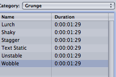 which we think works really well, we wanted this effect on all the titles but they didnt work as well. But overall we are happy with our final result.
which we think works really well, we wanted this effect on all the titles but they didnt work as well. But overall we are happy with our final result. Thursday 17 November 2011
Our Music!
Scary music! by Cindy,Hannah,Steph&Claire
Here is the music we created for our teaser trailer. We tried our best to fuse together a range of different sounds that together created a moody effect highlighting the genre of horror and increasing the tension.
 Garage Band
To do this we used the software Garageband and selected individual instruments. We felt that the low piano tones emphasised certain dramatic points within our trailer.
Although this software enabled us to select a large range of sounds, we wanted to improve the track by adding iMovie non-diagetic sound effects. Below are the four sounds we felt wwent well with the storyline of our trailer.

The electricity sound was used to emphasise the switching on and off of the lights in the corridor scene.

The heartbeat was used to symbolise Lucy's fear and increased towards the end at a faster pace.
This high pitch noise created an eerie atmosphere and complimented the dark lighting used.

Here is the music we created for our teaser trailer. We tried our best to fuse together a range of different sounds that together created a moody effect highlighting the genre of horror and increasing the tension.

To do this we used the software Garageband and selected individual instruments. We felt that the low piano tones emphasised certain dramatic points within our trailer.
Although this software enabled us to select a large range of sounds, we wanted to improve the track by adding iMovie non-diagetic sound effects. Below are the four sounds we felt wwent well with the storyline of our trailer.
The electricity sound was used to emphasise the switching on and off of the lights in the corridor scene.
The heartbeat was used to symbolise Lucy's fear and increased towards the end at a faster pace.
 |
We used this sound effect during the library scenes where Lucy's character was within the school. |
This high pitch noise created an eerie atmosphere and complimented the dark lighting used.
Our trailer movie title!
These are our titles in which we created using both 'ASPhotoshop' (for the background image) and 'LiveType'.


 We then exported this as a quicktime movie and imported it into our project! We use this music under the clip to create a feel to the frames differing to the rest of our trailer.

First we thought a dark background image would work well with our titles and possibly tea stained to create an eerie look and relates back to our production company ' Running Inc Productions' featured at the opening of our teaser trailer. Thus we found an image in which we were willing to work with;

Then we thought by using Photoshop we could merge an image of a diary or text within our titles by creating another layer above our tea stained background, lowering the opacity of the diary to make it fit within the stains to create an old fashioned look using the rubber tool to edit out the edges for the paper to 'dissolve' within the background.
We merged the layers as one and changed the contrast making it lower and dimming the lighting as well as the brightness to create an darker feel to the image before adding a slight gradient towards the bottom of the background.
Here is a video of our process.
Then on Livetype we inported the file as a background in which we then added our title name 'Blink'. Before putting on the effect as a 'Wobble' and Shaky to emphrasize the word Blink and to make it seem interesting for the audience to watch.
We then exported this as a quicktime movie and imported it into our project! We use this music under the clip to create a feel to the frames differing to the rest of our trailer.
Subscribe to:
Posts (Atom)